
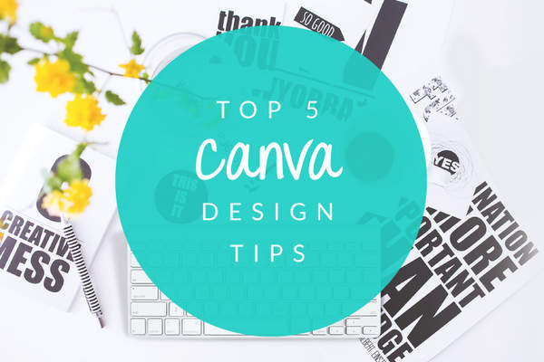
My Top 5 Canva Design Tips
My Top 5 Canva Design Tips
Contents
When designing with Canva you need to ensure that you’re not diluting your brand through inconsistency and bad design practices.
As a Graphic Designer at Social Concepts Consulting, I have come across some great designs created with Canva, but more often than not they just don’t hit the mark. Many business owners don’t have a great understanding of design and tend to break crucial design rules. Most importantly, they’re not considering their primary purpose for creating the design in the first place.
Here are my top 5 design tips to help you create stunning designs that compliment your brand.
Know Your Key Messages
The primary purpose of design is communication. The biggest problem with businesses creating their own imagery is that they are not effectively communicating their key messages and call to action.
Before you start designing, you need to be clear on your messaging, your target audience and what it is that you want them to do once they have engaged with your design. Perhaps you want them to contact you or purchase a product online.

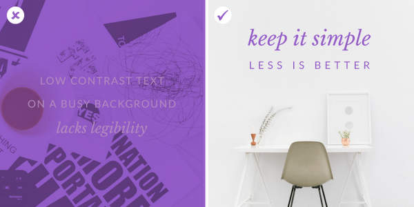
Keep It Simple
One of the biggest mistakes I have seen in Canva designs is illegibility. Do not use busy backgrounds with text over the top – It’s just too hard to read. Ensure that there is enough contrast between the background and the text. You don’t want to be using navy blue text on a black background.
Don’t be afraid of white space! A common mistake in design is filling spaces for the sake of filling them. Your design will become messy and distracting. As long as your design is well balanced, white space can be effective and make your design look super clean!
Avoid over-designing! Don’t incorporate too many design elements and ideas in the one design. It’s common for those new to Canva to get carried away and use a number of styles at once. This will just create clutter and your design will lack clarity. Using too many fonts in a design can also contribute to over-designing.
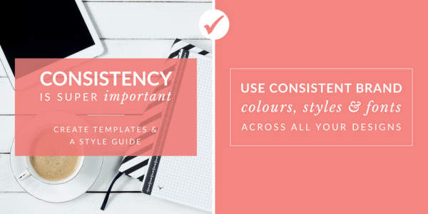
Be Consistent
A consistent brand is a memorable and authentic one. To ensure you are remaining consistent with your designs, create templates in Canva.
Create a style guide of your brand colours and fonts… and stick to them!
It’s important to also ensure that your brand’s tone of voice and messaging remain consistent across all of your designs.
Use Purposeful Hierarchy
Make sure you are using purposeful hierarchy. Your key messages should be large and styled as headings. You should also emphasise on your call to action by using a bolder, or larger, font than your body copy.
Do not use display fonts, such as cursive and handwritten fonts, for body copy. These fonts are a bit fancier and have been designed with aesthetic value in mind, rather than legibility. They can get too hard to read when used in larger blocks of text.
Keep your body copy simple and use display fonts for headings and keywords only.

Read more
- 10 Digital Experts Share Their Top Social Media Tips
- 5 Reasons You NEED To Use Google Analytics
- Google & Online Privacy In 2014
- Digital communication
- Public relation
Consider Text Formatting
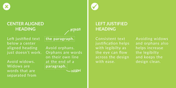
Ensure you are consistent with text alignment. It’s simply not good practice to use centred headings above left justified text, or to alternate between left and right justification, without good reason.
It’s also a good idea to ensure you are using consistent line lengths by avoiding hyphenation, widows and orphans.
When using Canva for your business there are many things you need to take into consideration beyond good design practice.
Find out more in my blog, Using Canva For Your Business.
Online Tools


Hi, this is a comment.
To get started with moderating, editing, and deleting comments, please visit the Comments screen in the dashboard.
Commenter avatars come from Gravatar.